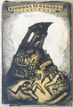
Description:
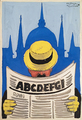
Constructivist tram poster for Chmura glasses by one of the greatest Hungarian poster designers Sándor Bortnyik. Chmura was a high end optics brand in the 1930s.
The author of the poster introduced the modernist-constructivist poster style in Hungary alongside Lajos Kassák and Róbert Berény. Bortnyik spent a few years in Weimar where he got acquainted with the Bauhaus school. Soon after his return to Hungary in 1926 his posters constructed with strict geometric forms and basic strong colours, simple block letters appeared on the streets. He often used humour as a tool to make the audience remember the advertised product. Due to the completely new nature of the style it soon became a success and many artists started to create in this manner. However, not everyone was capable of designing quality works, thus Bortnyik declared in 1933 that modern poster died.
This tram poster was published in 1930 when Kassák and the other modernist artists uttered that art has to take up a social role. Kassák published an article explaining that advertisements are important factors of economy and culture and a good advertisement should neither be manipulative nor a mere tool of business, but it should have an objective, informative, taste shaping and educating role. As for typography, the letters are supposed to be simple and functional and the image reduced to geometric forms. The Chmura poster completely fulfills these modernist requirements. The viewer's eyes are consciously led by the designer by altering the size and style of the fonts and placing them in front of bright coloured background.
The subject of the promotion is deliberately depicted in a simple way, the message is concise but striking to the eye as this is the only effective form for catching attention in the rushing urban environment - according to the modernist attitude to promotion at the time. The contrasts of colours, red, black and white are deliberately emphasized, the plane blocks are arranged next to each other like paper cut outs creating an eye catching dynamism and freshness. The humour expresses the main matter of the advertised company and it is not l'art pour l'art. The diagonal arrangement is also a very typical way of constructing of modernism.