Description:
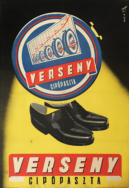
Original vintage commercial poster from the beginning of the 1950s. It was designed by Mátyás Sinka.
Mátyás Sinka is a fine Hungarian poster artist who started his career in the 1950s. During his artistic activity until the end of the 1970s, he designed numerous prominent posters and album covers. He created many humorous designs for campaigns for prevention from accidents, promoting healthcare, traffic rules and anti-alcoholism, and he designed skillful commercial posters as well. This work is a good example for the latter type.
The advertisement was created for the Race Shoe Polish. The poster is a simple, elegant piece. The composition shows the logo and the trademark of the brand with a shiny pair of smart black male shoes in front of a black and yellow background. The elements are carefully positioned in the middle of the poster and are highlighted by the dramatic visual effect of the strong contrast of the background colours. In addition, the yellow colour patch can seem as a spotlight behind the trademark, so the highlight of the elements is even more enhanced.
This strong focus on the brand design recalls the tendency of the “Sachplakat”. The so-called “object posters” featured a realistic depiction of the advertised product with only a few or no other elements. German poster art was revolutionized by Lucien Bernhardt who is considered to be the father of Sachplakat style. His works in 1905 were striking with their stark simplicity and clean, bold typography among the common stilted Art Nouveau pieces of the period. In Hungary Márton Tuszkay was the first one to introduce the new approach in advertising in the 1910s. Even though Sinka didn’t present the shoe polish product itself in its original packaging on this poster, his work can be considered as an object poster. Specific elements of the product’s original packaging design are highly emphasized, which make a concentrated composition.
The skillful use and the stressing of strong, contrasting colours, flat shapes, spectacular angles and perspectives made object posters interesting, as well as the effective typographic design. This poster represents the excellence of the product by depicting the perfectly polished shoes in an impressive angle. In the meantime, the entire design has an ethereal, flat-like character with the floating trademark and logo of the brand. However, the spotlight-effect of the background enhances the three dimensions. These simultaneous, but contradictory visual impressions create an exciting and complex visual world around the captured elements.
All in all, this clean and tight composition was a modern piece in its time. It shows the elegance and decorativeness of Sinka’s commercial designs on which he could choose the proper tools to create the perfect atmosphere. It is also a good indicator of how the object poster style remained up-to-date and varied even in the middle of the century in Hungary, similarly to Switzerland. Certainly, the pieces could be effective advertisements as they imprinted the specific design of products and brands to the mind of viewers.


