History
- Introduction
- The beginnings - Art Nouveau & Red Propaganda (1895 - 1919)
- Art Deco & Modernism (1920 - 1944)
- The distinctive poster art of a short-lived democracy (1945 - 1949)
- Socialist Realism and the continuity of the modern poster (1950 - 1955)
- A cavalcade of styles & techniques (1956 - 1970)
- The low-culture and the neo avantgarde (1971 - 1990)
A cavalcade of styles & techniques (1956 - 1970)
Take a look at our inventory from this period by: clicking here.
The new trends that first appeared at the poster exhibition in 1956, determined the path of Hungarian poster art for the next two and a half decades. Most of the exhibited works were original designs and some of them were never printed. Despite the expectations of the ideologists and functionaries of the state party, the artists managed to alter the main characteristics of poster design. As opposed to the schematic compositions of the early 1950s, the new posters became more and more artistic, original and poster-like again. The paradigm shift was clear: the poster had to become a personal and original art form characterized by the artist’s own style. According to the new standard, the poster had to be the result of a creative process – and most of all: it must attract the audience. This expressionist poster style was typical of the second half of the 1950s. The artists used flowing, splashed colors and intense brushwork, which made their poster designs very artistic. The undertone of their visual style was often ironic, humorous, grotesque or lyric. Unlike the former photo-like socialist realist style, the new posters were full of colors, less realistic and more flat-like and compact.
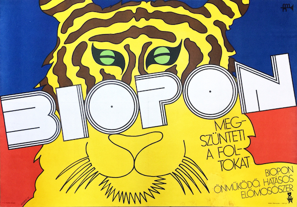
Gyorgy Kemeny - Biopon washing powder 1969 vintage Hungarian Pop Art advertising poster Tiger
During this new great period, György Konecsni played an important role as the leading graphic design teacher of the era. His students (Máté, Darvas, Görög, Ernyei, etc.) and other members of the young generation (Balogh, Szilvásy, Lengyel, Benkő, etc.) were able to build an oeuvre based on these foundations. Between 1956 and 1959 they created mostly expressive compositions, which were driven by contrasts. They used intensive, colorful shapes and interesting lighting effects. Many of the already well-established artists like Győző Szilas, László Káldor, Zoltán Tamássi, Mátyás Gál, Tibor Gönczi Gebhardt and József Bottlik continued to work. These years were characterized by a political thaw, which meant milder censorship and less governmental influence in the field of visual art. This enabled an unprecedented new golden age of poster design especially for cultural posters. Sándor Ernyei, Lajos Görög, Árpád Darvas, András Máté, and Nándor Szilvásy started to design film posters, which was the subject that gave the most freedom to the artists. During the 1960s, the style of Hungarian posters were rapidly changing and constantly absorbing new influences both from the past and from contemporary artistic trends. Printing and publishing was still controlled by MAHIR (Hungarian Advertising Company), but artists were also delegated members of the jury that made a decision whether a poster design should be printed or not. This enabled them to have some quality control over the process. Because of its practical nature, the poster was not in the focus of censorship. While the progressive neo avant-garde art was barely tolerated or forbidden, almost everything was possible in poster art. The newest art tendencies allowed posters to express an implicit and veiled criticism of the system.
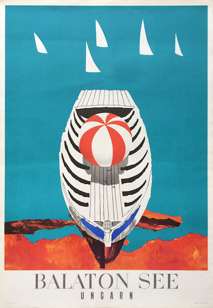
Istvan Balogh - Lake Balaton Hungary 1964 Hungarian vintage travel poster
This relative freedom was similar to that in Poland, where poster art was able to achieve international success. During these years countless styles and trends coexisted: Pop Art, Op Art, Neo Art Nouveau, Swiss Style, Psychedelic Art, New realism, Expressionism, Conceptualism and Minimalism; and an amazing array of techniques and their combinations were in use: paper cut-outs, photomontage, photography, line drawing, painting, typographic design, and so on.
The numerous commissions, the artistic independence and the good income made poster design desirable for painters thus many of them got involved in it. Some of them only designed a few pieces while others were prolific, and considered posters to be as important part of their oeuvre as their other works. Endre Bálint, member of the former “European School”, made playful and grotesque posters, on which the influence of folk art is visible (this was also present on his paintings). Tibor Csernus was a central figure among the young, rebelling painters of the time. He painted sur-naturalist (surreal naturalist) paintings, which are characterized by having rich facture; their surface is covered with a thick layer of smacked and smeared paint. These intensive surfaces appear on his posters as well. Csernus’ close friend was László Lakner whose earlier posters are mostly Pop Art works. Later he showed his rather conceptual or hyper-realistic approach on his designs. He often used photomontage techniques. Lakner’s posters - in most cases for exhibitions and movies - often aim on investigating the nature of art, which is a central question of conceptual art.
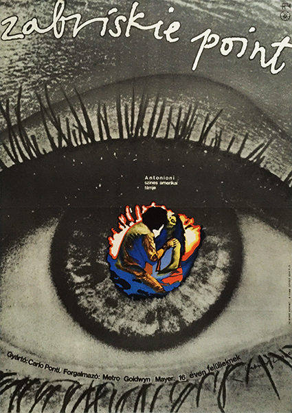
Lakner Laszlo Zabriskie Point 1970 Hungarian movie poster
Paper cut-outs also became a very popular and widely used technique in poster design in the 1960s. The artists used cut-out forms from colored, shiny or metallic papers and glued them on a background. With the use of this technique the compositions became extremely flat-like since they solely consisted of homogenous, flat shapes (see some of Vilmos Kovács’ and Árpád Darvas’ works from the mid 1960s). The artists also used line art; for example István Balogh, who is primarily known for his expressive painting style, made some outstanding, clearly drawn designs in the 1960s, which was inspired by folk art. This delicate style is apparent in János Kass’ and Sándor Ernyei’s fantastic works too. The humorous, optimistic cartoon-like style was traditional in Hungary, and it lived on during the 1960s. László Káldor often used playful, lovely characters, which resemble cartoon figures. Similar style appeared on the posters of the Macskássy-brothers. Gyula Macskássy was rather known from his work as a pioneer in animation movie; while his brother János was a busy poster artist, who regularly created the advertisements of the state lottery. His colorful compositions represented cheerful scenes with cartoon-like figures. Sándor Lengyel was also a master of these delightful, decorative figures in his designs (examples: “Hüsi” soft drink, Don’t let your money lay around – “Ne hevertesse a pénzét…”, Prepare for winter in time – “Idejében készüljön a télre…”, etc.). Sándor Benkő also used this style; he used colorful paper-cut-out compositions on his many circus and theatre posters. He also invented his own techniques, often incorporated humorous or even grotesque elements. Some of his posters resemble psychedelic art.
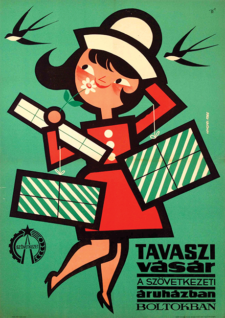
Sandor Lengyel - Spring Fair 1966 Hungarian vintage poster
Theater plays offered an other important task for poster design; besides Benkő, István Köpeczi Bócz and Antal Gunda were a prominent artists in this field. Köpeczi Bócz created lovely drawn compositions, besides he was also active as stage designer. Gunda's paper cut-out and drawn designs fitted perfectly to each performance. Gunda was also known from his movie posters.
Photography and the use of photos played a central role in Hungarian poster art of the 1960s. It was often just glued on the surface of the original design, mixed with other techniques, and sometimes it was somehow modified by overpainting or other methods. It could become a part of a paper-cut composition, or it could even appear as a photomontage. On movie posters, the use of photo was very popular, since it was a good way to show the starring actors and actresses, and it offered various artistic opportunities. The commissioned graphic artists received a press package for every movie, which included stills, that, in many cases, became the source material for the design (see: Lajos Görög: 8½, András Máté: A very private affair). Photomontage has been in use since it first appeared, to combine individual photographs with each other, in order to create a new subject or visual image. Ever since its first use by Dadaist artists, the photomontage always possessed a special, provocative force. This feature was very useful in poster art, since it attracts and captures the viewer’s attention.
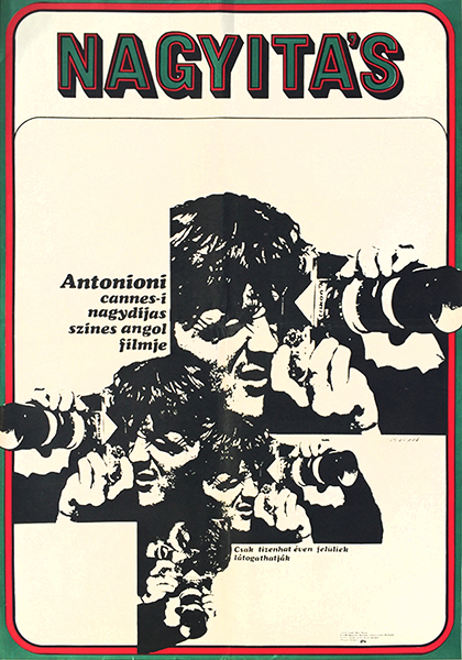
Aprad Szabo - Blow-Up 1969 Hungarian movie poster
Graphic elements, photographs and text can be combined into one artistic unity, as visible on András Máté’s masterpiece for Fellini's “La Dolce Vita”. In the sixties the use of overexposed black and white photography became very popular. These so-called “burned” photos were introduced by József Finta, who was originally a photographer, and became a great poster artist. This technique, the over-exposure of the pictures resulted in a very strong contrast which provided a highly decorative and artistic effect. The remaining shapes are almost like black stains which fitted better the poster’s visual language. This period was full with experimentation: photography and film influenced poster art. Artists used a wide array of effects, like distortion and blow up. The photographs used for these designs were almost always black and white, which resulted in incredibly strong contrasts. This contrast effect of black and white was the central idea in one leading artistic tendency of the age: the Op Art. The Hungarian born Victor Vasarely’s art (he was a former student of Sándor Bortnyik) received a lot of attention in the 1960s, when he had a major exhibition in Hungary. His optic tricks and illusions influenced some poster artists, such as Magda Vörösmarty (Hungarian Advertiser – “Magyar Hirdető” is an outstanding example) and Lajos Görög, who liked to use dazzling images.
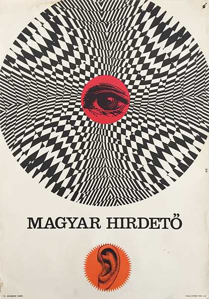
Magda Vorosmarty - Hungarian Advertising Company 1965 poster
Pop Art was a more dominant tendency in the 1960s than Op Art. While Op Art was based on the contrast of black and white, illusions and picture plane, Pop Art posters were extremely vivid and colorful. Hungarian pop art posters appeared on the streets around 1965. However the very first Pop Art inspired poster design was created by Tibor Zala, it was a commercial poster for the Opera lipstick from as early as 1959. In the sixties, more artists started to use vibrant solid colors, like pink, yellow, strong reds and blues. Pop Art soon became very popular because of its “Western” nature and origin. It first appeared in the US and in the UK as an artistic reflection of consumerism and popular culture. It imported the simple everyday products into the field of art (like Warhol’s Campbell soup or Lichtenstein’s comics). Consumer society and popular culture hardly existed in socialist Hungary; here Pop Art was more of a symbol of the desired Western culture. It was a radical, scandalous style, and it sometimes was even forbidden.
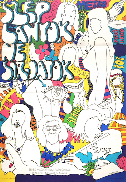
Gyorgy Kemeny - Pretty Girls, Don't Cry 1970 vintage Hungarian Pop Art movie poster music film
Árpád Darvas had been designing outstanding Pop Art posters from 1967. His early Pop Art works were influenced by the visual world of comic books. They resemble the pictures of Roy Lichtenstein, although his style was different in many ways (he created great movie posters, like: A Saturnus nem válaszol, Becsületbeli ügy, A kalózkapitány, Az algíri csata). He filled empty surfaces with large raster dots, used speech balloons and heavily stylized characters, creating lively, colorful compositions. These comics inspired posters were usually made for movies, although there are exceptions (Casco). They often showed Darvas’ humorous and playful attitude.
The Pop Art exhibition of György Kemény in 1968, featuring his early Pop Art posters along with paintings and objects, was prohibited by the censors even though his Pop Art posters got through and were published with no difficulties. They could be seen on walls and advertising columns and all around the country. Pop Art was a determining style for many Hungarian poster designers during the 1960s. Judit Wigner and Antal Révész worked together, and were heavily influenced by Pop Art. The early works of István Bakos are good examples of Hungarian Pop Art (Orient Mokka, A félszemű seriff). József Pecsenke was also known from his daring Pop Art compositions that usually appeared on movie posters. Vilmos Kovács had a characteristic Pop Art inspired style, which used strong colors and an individual drawing style. Gyula Konkoly, a well-known painter designed a fantastic poster in this manner for the Beatles' Yellow Submarine and some other great Pop Art posters.
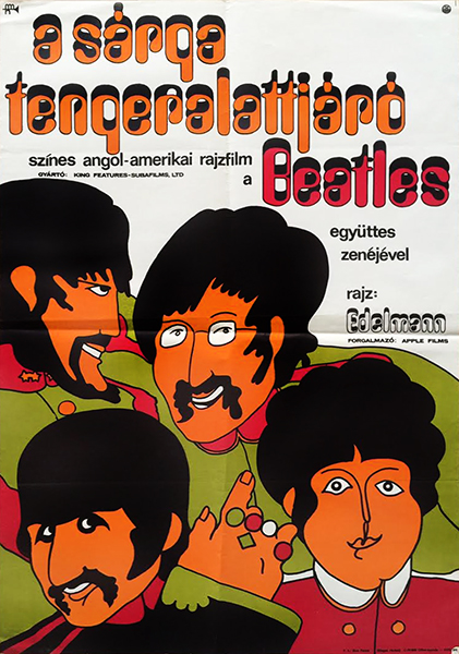
Gyula Konkoly - Beatles Yellow Submarine Hungarian poster
György Kemény's Pop Art posters are outstanding works. He visited his former master, Pál Gábor in 1963 in Paris, where he was able to see the works of Wesselman, Warhol, and Niki de Saint-Phalle; which strongly influenced his way of thinking. Kemény built his Pop Art compositions from big, colorful fields, which have strong but decoratively curved contour lines. Kemény had distinctively original ideas and an outstanding sense of humour, which are well recognizable on most of his best works ("Biopon" and “Az esernyő öltöztet” – The umbrella dresses you up). He is a talented and skilled drawer, which is visible on his pop art designs and on the later works too (for example his magnificent poster for Fahrenheit 451). Kemény's works are often highly erotic, which caused scandals in their age (on his umbrella poster the woman wears nothing but an umbrella!).
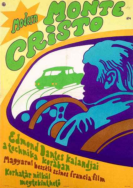
Arpad Darvas - The Return of Monte Cristo 1969 Hungarian movie poster
Some Pop Art works were labelled as Neo Art Nouveau, since these works drew from the decorativeness and the fine and elegant style of the Art Nouveau or Jugendstil. However, this style had much more in common with contemporary American art (painting), than with the poster art of the turn of the century. Some Hungarian Pop Art posters show similarities with the American psychedelic rock posters (such as the posters by Wes Wilson), which also borrowed a lot from the Art Nouveau tradition.
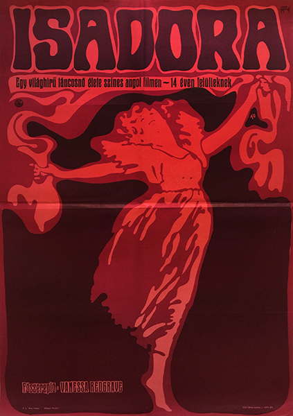
Olga Tovisvary - Isadora Vanessa Redgrave 1971 Hungarian movie poster
The term “Neo Art Nouveau” can be used to describe some posters of András Máté. He made a famous series of travel posters for the Hungarian Airlines, Malév. The series includes seven posters. Each poster is for a travel destination, and all seven are executed in the same basic style, although they slightly vary. Each destination is depicted in a very unique and decorative way; they are constructed of thin, colored fields, like small blocks, which have a pleasing mosaic-like effect. Máté was one of the most talented artists of his time, he designed countless outstanding posters. His movie (La Dolce Vita, Love with the Proper Stranger, Stolen Kisses, etc.) and travel posters (The Malév series, Ibusz Budapest, Ibusz Balaton, etc.) are his best known works.
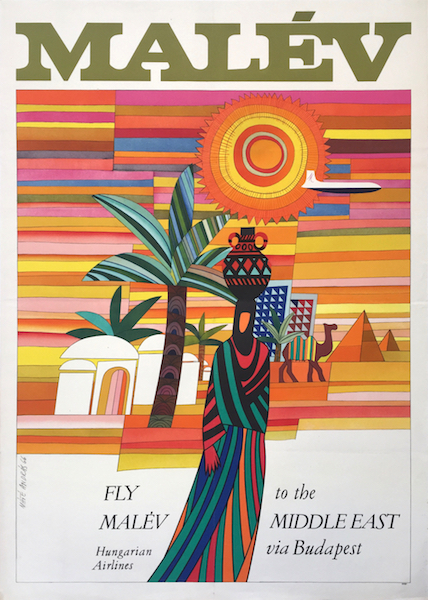
Andras Mate - Fly Malev to the Middle East via Budapest 1966 Hungarian vintage aviation airline poster
Another, completely different style, the typographic posters were also quite common. This tendency, known by many as the “Swiss style”, relies on the traditions of constructivist design, and its aesthetics derive from contemporary minimalism. Letters and numbers can become powerful symbols and emblems in the hands of a skilled graphic artist. The most prominent representative of this stlye in Hungary was Gábor Papp, an influential poster artist, organizer and art theorist of his time. He was famous for his poster designs which use very strong, but at the same time minimalistic symbols created from letters and numbers, in very clear and well designed compositions. Papp designed a series of posters for the Budapest International Fair (BNV) and for the World Fine Art Week. He didn’t only design posters and other advertisements, but he also designed logos, which were used for decades. This typographic approach was used by other artists as well, for example by Lajos Görög in some of his works, and So-Ky (László Sós and Éva Kemény).
The duo, which used the name “So-Ky” received many commissions; they were closely associated with the ruling party. They designed countless posters for products, movies and propaganda. Their style rooted in classic avant-garde, and they frequently used photomontage and collage techniques. The couple So-Ky is today often criticized for their strong communist belief and because they served the system. However the artistic quality of their works is out of question; they could use the old socialist symbols (hammer, sickle, red star etc.) as parts of fresh and impressive compositions.
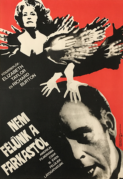
So-Ky - Who's Afraid of Virginia Woolf? 1968 original Hungarian movie poster
The most important artist group in commercial graphic design during this period was organized by Gábor Papp, whose works were started to be exhibited in the early sixties. The influential teacher, György Konecsni helped the formation of the group consisting of his students and other young artists, but later on Gábor Papp became the head of the group. He intended to evoke the attention of the audience and the customer to the importance of quality graphic design. To achieve this, the group, which was known as “Papp-group”, organized regular exhibitions. The members were selected earlier by Konecsni, who originally suggested these artists to design the pages of a calendar. From 1963, Papp was the one who organized exhibitions in the exhibition rooms of the Foreign Affairs’ Institute in Dorottya street, in Budapest. The members didn’t have common artistic ideas or style; they were connected by their shared interest in outstanding artistic design. The members were: András Máté, Árpád Darvas, Sándor Ernyei, József Finta, Lajos Görög, István Balogh, Nándor Szilvásy, István Hegedűs, Emma Heinzelmann, Mátyás Sinka, Crescencia Zelenák and Gábor Papp. The exhibitions always had specific themes. Each was about a particular area of graphic design (like typography, album covers, posters, stamps, logo design, illustration, etc.).
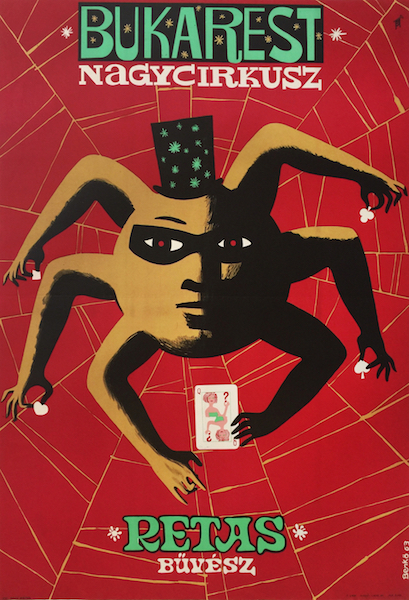
Sandor Benko - Retas magician illusionist Bucharest Grand Circus Romanian 1963 Hungarian poster
The Papp-group was a determining entity of Hungarian poster art, and at the same time many other great artists worked along them: Árpád Bognár, Margit Sándor, Tibor Zala, Győző Varga, Antal Gunda, Zsuzsa T. Gerő, Róbert Muray, Ilona Müller, Irén Tomaska, Vilmos Kovács, just to mention a few. The cultural turmoil of the 1960s is well reflected on the posters; they show the imprints of sexual revolution, beat and rock music, television, the dawn of mass media, cinema, popular culture, contemporary art styles and above all: rebellion. This is a very colorful and diverse period, in which countless great poster designs were made. This golden age was far from being in decline by the end of the decade, the last great period of Hungarian poster art was about to continue during the 1970s and 1980s as well.
Take a look at our inventory from this period by: clicking here.