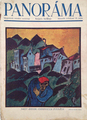
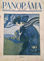
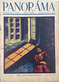
Description:
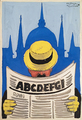
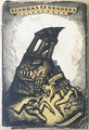
The author of this poster, Kalman Csizmazia was a pupil of Sandor Bortnyik in his Hungarian Bauhaus school, the Muhely. Sandor Bortnyik was the one who introduced modernist style to Hungarian graphic design. In 1927 Bortnyik published an article about tasks the modern commercial should fulfill. In accordance with an eralier article on the subject by Lajos Kassak, he expressed that advertising is an important factor both in economics and culture, and highlighted that a good commercial should never be manipulative, but objective and informative. The author also mentioned the suggestive artistic power of commercial graphic design, what an artist should utilize in order to shape the public taste. As for the visual manifestation of the new graphic art's philosophy, Bortnyik and Kassak accentuated the simplicity of both visual and textual elements of the advertisements, the functionality what manifests in the application of simple, geometric shapes instead of complex, painting-like images. The eyes of the viewer is led by the alternation of various font types and sizes or by extra emphasis of certain information by placing those in front of bright coloured background. They believed that typography should be equally significant as other graphic elements of the design. The harmony isn't achieved by symmetry, but by the perfect proportions of contrasts.
This poster comforms all the above mentioned characteristics, what is no surprise knowing that the author was Bortnyik's student. The typography, the contrast between red, blue and white colours as well as between the geometric colour blocks of the background and the cylindric shape of the advertised product's body. Csizmazia also applied humour - what tool was often used by his master as well - when impersonifying the poster's subject, a can of varnish. The rhythm of the colours, the shapes, the contrasts, the active and still elements result in an easily understandable and very harmonious image, that is a perfect commercial.
In 1933, Bortnyik published a short-lived poster art journal, titled Plakat (Poster), and the fourth issue, published in June of that year contained a reproduced poster design artwork by Perlmutter.