Description:
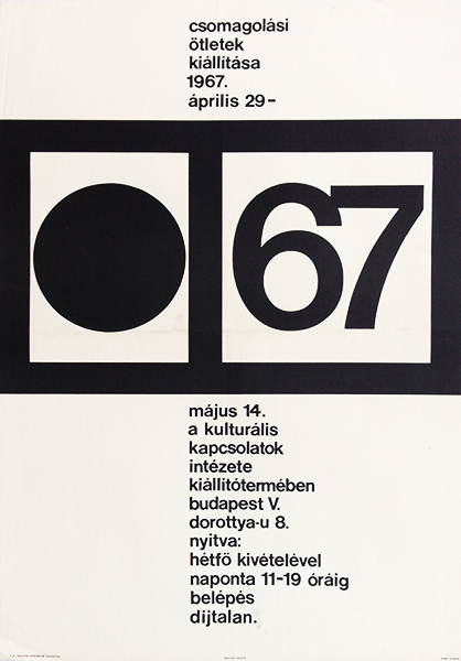
Typographic poster by one of the greatest graphic designers and leader of the 'Papp Group', Gabor Papp. The poster is very clean and simple, where the contrast given by the use of black and white determines the atmosphere of the image. The text is strictly organized and the composition doesn't contain anything else but the necessary information: name, time and place of the event. The piece is a part of a series made by Papp, advertising different exhibition with the same design. Only the image in the first square changes (and the relevant information). In this case the image is a large black spot.


