Description:
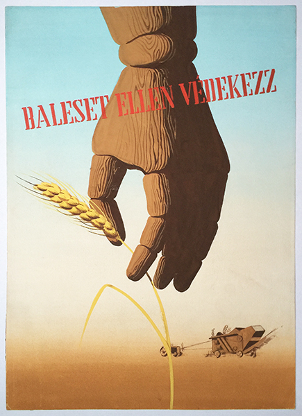
This spectacular painted artwork was created as a safety propaganda poster maquette around the middle of the 20th century. It was aimed to warn the audience to defend against accidents while working.
The visual characteristics of the artwork suggest that it must have been created between 1945 and 1949. The reason is that this design shows the traits of the distinctive poster art of a short-lived democracy in Hungary during these years. After the World War II, the Soviet Red Army occupied the country, but the Soviets didn’t overcome the newly evolving political system. The short democratic period brought the revival of political poster art: there was a boom of propaganda posters with compact and powerful design. The most important function of them was to be easy to understand and convincing, so the designers employed well-known symbols and visual signs, but in a new context, properly to the changed political and social circumstances. The leading figure of the period was György Konecsni, the master, who influenced many others as well.
He was one of the masters of Olga Tövisváry, the creator artist of this design, as well. She went to the Academy of Applied Arts between 1945 and 1948, after which she also attended the Hungarian Academy of Fine Arts. She designed numerous movie, cultural and commercial posters for the biggest national Hungarian companies, and created the graphics of the foreign exhibitions of Hungexpo, the biggest Hungarian exhibition organizer company. Her fine graphical works showed modernist tones with an expressive character.
Her design visible here is a concentrated, powerful composition based on a shocking idea. The artwork shows the consequences of the careless and incautious work: a prosthetic hand made of wood appears in the close foreground, holding a straw. There is an agricultural machine working on the fields in the far background, so the cause of the accident is also presented. The red typography, reading the slogan ‘defend against accidents’, is put on the design as if it was a stamp on the picture.
The distance between the foreground and the background is highly emphasized by the used scales, which gives a sharp and catchy visual effect to the design. Over and above, this three-dimensional effect is in a strong contrast with the flatness of the background. As it is a huge colourful spot with brown, beige and light blue zones fading into each other, it represents the fields, the horizon and the high sky without many additional details. The small image of the agricultural machine is just a little reminder of the location. The straw motif also makes it clear that the design focuses on the problems of agricultural workers and peasants, they are the main target group here, as it was typical of the period. The wooden prosthetic hand is hanging from above, and is in the centre of the viewer’s attention unavoidably. The delicate lines of the nervure of the wood, the soft shapes and silhouette of the object, and the gently stylized portrayal bring tenderness to the design in contrast to the stark cruelty of it. The bold cut-out, the sharp perspective and the intensive light and shade-effect enhance the dramatic nature further. The endless distance behind expresses the eternal value of the message, which is a mechanism, most probably, learnt from Konecsni. It derived from the metaphysical painting art of the period, and became a typical tool of the contemporary poster art in Hungary. Tövisváry not only adapted the tools and techniques of her time, but created a fine, original piece. Her work is a smart and strong design.
Written by: Anita Pásztor


