Description:
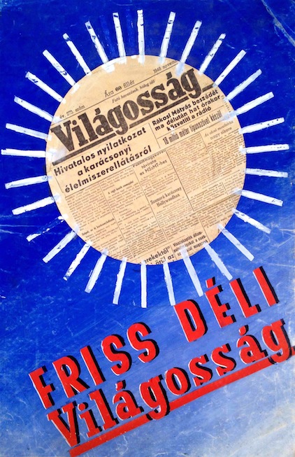
Original poster maquette from the postwar era, created by FILO.
FILO (Mihályfi Ernőné Ficher Ilona) was a Hungarian poster designer whose career started in the early 1930s, but most of her output is from after 1945. She was studying in Munich Germany, at the Academy for Applied Arts. However, because of the rise of Nazism, she fled from Germany and returned home. Then he started designing advertisements, magazine covers and posters. Her highly successful and remarkable political posters were created after 1945. They were compact compositions with affective symbols.
This design was also created during that period, exactly in the year 1948. That time a distinctive poster art emerged during a short-lived democracy in Hungary between 1945 and 1949. It could be possible under the special circumstances of the time. After the World War II, the Soviet Red Army occupied the country, but the Soviets didn’t overcome the newly evolving political system. The short democratic period brought the revival of political poster art: there was a boom of propaganda posters with compact and powerful design. The most important function of them was to be easy to understand and convincing, so the designers employed well-known symbols and visual signs, but in a new context, properly to the changed political and social situation. The uplift had a good effect on the whole of poster art as well.
Although this maquette by FILO was a commercial design, it also reflected the concentratedness that was typical of the poster art of the period. She was commissioned by the Clarity newspaper which was a Hungarian daily paper from Cluj Napoca, released between 1944 and 1953. The aim of the magazine was to support the rebuilding process after the World War II, this can be one of the reasons of the positive sounding name choice.
The design is a simple, but spectacular composition, focusing on the name – and so the mission – of the newspaper. It depicts a sun-shaped cut-out of the newspaper itself against a bright blue background. The sunbeams are also represented by glued white lines around the collage newspaper circle. The typographic design appears at the bottom of the image in diagonally rising lines to the right, in the shape of sightful red letters with a bit of shading. On the whole, the design not only pictures the symbol of clarity with the well-known, immediately recognisable symbol of the sun, but it is a reflection of clarity itself as well. This could happen to make it to be a potent design in the period. The piece is also a good example of the mixed technique FILO preferred using: a symbolic visual language, the use of collage, strong colours and a basic, clear typography. In the end, the final poster was printed using this design, but the text was changed and instead of the collage newspaper circle, the printed poster used a painted version of it.


