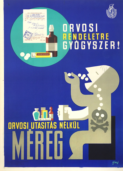
With the doctor's medical instruction, it's medicine! Without medical instructions it's poison
Hungarian title:
Orvosi rendeletre gyógyszer! Orvosi utasítás nélkül méreg régi plakát
Artist:
Size:
B2 (cca. 70 x 50 cm)
Year:
1965
Condition:
Fine, light fold marks and wear.
Material:
Paper, offset lithography.
Price: US$1200
Description:
With the doctor's medical instruction, it's medicine! Without medical instructions it's poison is a 1965 vintage Hungarian health propaganda poster designed by Tibor Gonczi Gebhardt.
Health propaganda poster by Tibor Gönczi Gebhardt, one of the most versatile graphic designers in the history of Hungarian poster art. Gönczi’s career started in the 1920s and he was active for decades. During his career he did not create following just one style, he designed according to the current trends in a certain era. However, regardless of the style, his character and attitude remained a constant factor and were apparent and recognizable on each design he made.
The 1960s was a rich and active period in Hungarian poster art on the field of commercial, cultural and political poster as well. The forced simplicity and directness typical of the 1950s finally ended, poster artists enjoyed more autonomy and freedom for expression, hence a wave of experimenting with a great variety of manners started. Therefore, during the so-called golden age of Hungarian poster art numerous styles co-existed and were often combined.
The main function of poster remained, that is, spreading information, forming the public’s taste and educating, but at the same time it became a piece of modern art, a symbol of opening up to the international scene, that contributed to a colourful street image and was a testimony of an improving economy, culture and social life. The posters had to grab the attention of the audience with their charismatic visual language that managed to transfer a concise message. In order to attain this, artists often applied intense colours and strong contrasts, a humorous or even a grotesque style. The photo-like, immense characters of socialist-realism changed to flat, often geometric and compact, images where the typography became an organic part of the composition.
Not only commercial, movie or cultural posters went through a visual upswing, but posters for governmental commissions as well. The often didactic social subjects, such as the importance of blood giving, health care, anti-alcohol propaganda, prevention, etc. did continue existing, however, the monotonous and boring style of the former decade faded away.
This poster was assigned to Gönczi by the Health Education Centre, hence their logo in the top right corner. Health Education Centre was founded by the Ministry of Health in 1958 and from that year they were responsible for public health education and prevention, including publishing posters for the purpose. This piece warns the audience that taking strong pills without the doctor’s instruction makes medication poison while if the instructions are followed it’s a cure.
Calling the attention to the dangers related to medication was a case at issue in the era what is well demonstrated by an article of the period. "In order to protect, increase or recover one's health, all members of society need health education to a certain extent. [...] The number of patients visiting doctors or getting into hospitals allows us a rough guess of the number of those who got poisoning due to improper use of medication [...] The educational work of pharmacists has gone through a significant improvement but the process was not steady until the foundation of the Health Education Center.“
Gönczi’s design is an objective, neat and disciplined visual manifestation of the playful imagination referring to a serious subject. The composition can be divided into two parts. The top part behaves like a blow up of the objects on the table below it, while the lower part presents the practice of taking medication. In the 1960s this way of constructing posters was quite common.
The upper part of the image lets us see the products on the table, the drugs and a doctor’s prescription. The brown glass bottle is beautifully drawn, coloured with gentle shades highlighting the delicate shape of the bottle, resembling Art Deco style. This creates an exciting contrast with the plastic tube with pills next to it, that is a flat like schematized image. The prescription behind these is almost photorealistic. The 3 elements of this blow up was drawn in three different styles and still, it gives a perfect unity. The text next to it says: ‘With the doctor’s medical instruction: it’s a cure!’
The lower part of the composition consists of precisely constructed two-dimensional geometric forms and letters that not only provide information, but visually enhance the image. The figure gets the greatest emphasis on the poster as a result of the contrast between the bright white part of his body and the blue background. The focus falls on his white face as he is happily pouring countless number of pills in his mouth, but then there is a sharp edge, where the bright transforms to grey and problems start. That point is the moment when the pills he took turn into poison and end in death symbolized by a skull and bones. This simple image cleverly describes the risks hidden in irresponsible medicine consumption. The text saying ‘...poison without the doctor’s instruction’ is incorporated in the composition in a way that it becomes the table where the figure is sitting at.


