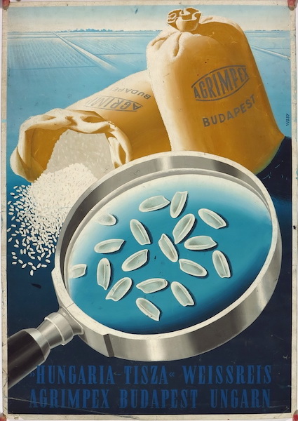
Hungaria - Tisza Rice - poster maquette
Hungarian title:
Hungaria - Tisza Weissreis Agrimpex Budapest Ungarn plakátterv
Artist:
Gábor Vissy
Size:
A1 1 Sheet (cca. 84 x 59 cm)
Year:
1951
Condition:
Fine, light wear and creasing.
Material:
Paper, hand painting, drawing (paint, pencil).
Price: US$50000
Description:
This poster mockup was created around the middle of the 20th century, for a commercial poster about the Hungarian Tisza Rice Agrimpex Budapest Company. The future-to-be poster was designed for a foreign audience, as the inscription is in German. Today the Agrimpex Company is a firm dealing with commerce of grains, seeds, tobacco and crops, but more than 50 years ago the predecessor company started with only rice.
The artwork was created by Gábor Vissy. There is not so much information known about him, but several of his posters can be found from between the 1950s and the 1980s. The early pieces contain safety propaganda works and commercial posters (e. g. a 1951 poster for Hungarotex, one of the biggest Hungarian export companies). In 1953 some of his posters were exhibited in the national poster exhibition. He also created graphic illustrations for books. During the 1980s he participated several times at the Applied Graphic Arts Biennale.
This poster maquette here is a special piece as it stands out from the average works of the period. It was created in 1951. The first part of the 1950s was characterised by the dominance of the Socialist Realism. Artistic freedom was under constraint by the political dictatorship of the era, in accordance with other Eastern European countries in the Soviet Union. The obligatory norms meant that poster designers had to meet the requirements of socialist content and a realist manner. Thus, mostly a heroic, figurative portrayal was employed to make the propagandistic messages clear and easy to understand. However, the export posters of the period could be exceptions. As they were made for a mostly Western audience, their approach was completely different from the local propaganda. Export companies, such as the advertised Agrimpex here, had independent advertising rights, so they commissioned posters which followed the international trends of poster design. That is to say, these pieces were clear, effective and decorative. Their style rather resembled the posters from the 1930s and the 1940s.
This poster artwork is a perfect example of the fine export posters of the time. It absolutely recalls the poster styles of previous periods. It mostly recaptures the distinctive poster art of a short-lived democracy in Hungary between 1945 and 1949. Back then, after the World War II, the Soviet Red Army occupied the country, but the Soviets didn’t overcome the newly evolving political system. The short democratic period brought the revival of political poster art: there was a boom of propaganda posters with powerful design. Designers employed well-known symbols and visual signs, but in a new context, properly to the changed political and social circumstances. The visual world of this poster mockup perfectly fits the character of Hungarian posters between 1945 and 1949.
The design is compact and concentrated. Two sacks of rice can be seen with the logo of the company, one lying on the ground as rice is coming out of it, and the other standing against it. A huge-scaled magnifying glass is depicted in the close foreground, making some rice highly visible. The name of the company is placed at the bottom of the composition, while the background shows large fieldlands from the bird’s eye-view.
The painted composition is dominated by the shades of blue as they turn gradually light to dark from the background towards the foreground. The two natural, ecru coloured sacks and the black, grey and white coloured magnifying glass are in the centre, in contrast with the background by their colours and scales. Moreover, it can be said that the whole picture is built on the three-dimensional play. The endless distance behind expresses the eternal value of the message, which was a favoured applied mechanism of György Konecsni, the leading figure of Hungarian poster art between 1945 and 1949. This tool derived from the metaphysical painting art of that period, and became a typical means in poster art, too. But not only the endless background reveals the influence of Konecsni here. The portrayal is decoratively stylized with the sharp outlines and the refined shading. Together with the harmonised colours, these characteristics evoke Konecsni’s classicist style from the 1930s, as well. Therefore, this export poster artwork also represents a higher artistic quality.


