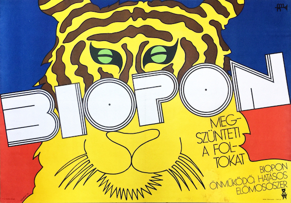
Biopon washing powder - It makes the stains (stripes) disappear
Hungarian title:
Biopon mosópor - Megszünteti a foltokat régi plakát
Artist:
Size:
A0 2 Sheet (cca. 116 x 82 cm)
Year:
1969
Condition:
Fine, restored paper loss at the lower right, light fold marks and wear, some staining.
Material:
Paper, offset lithography.
Price: US$10000
Description:
An outstanding masterpiece of Pop art design. 'Biopon. All stains disappear.' Subtitle: 'Biopon, automatic, effective detergent.'
György Kemény’s colourful, Pop art-influenced posters were shocking in their age. For the contemporary audience they represented the modern, "western” way of life, something extraordinary in the grayness of socialism.
Kemény grew up in Budapest, he has been drawing since the age of 4, and always wanted to be an artist.He was not accepted to the Academy of Fine Arts for the first attempt, thus he decided to spend a year in the studio of the famous poster designer of the age, Pál Gábor. During this year he fell in love with poster art. With his own designs he attracted the attention of the critics very early. Next year he started to study at the Academy, on the faculty of graphics. He got into the Hungarian neo-avantgarde circles, and became friends with artists such as László Lakner and Dóra Maurer. With Lakner they were regulars at Fészek Klub, a library and meeting place for artists with a modern spirit, where they could find the newest issues of a variety of western magazines. In 1961 he finished the Academy and started to work as a poster-artist. Besides, he worked (and works to this day) in different fields of visual art: he makes installations with video, objects, conceptual works, sculptures and drawings.
In the neo-avantgarde artists society several works and performances were produced with a critical tone. Most of these focused on the problems of the socialist system. In 1963 he got a life-changing invitation from his friend and former master, Pál Gábor, who was running a famous advertising studio “Typogabor” in Paris at the time. Every moment during this journey meant the world for Kemeny. He spent just one hour on the train station in Vienna, and he was amazed by the real “western” city. In Paris, he was fascinated by the colourful life of the city and the artworks of the contemporary western artists, like Christo, Jim Dine and Niki the Saint-Phalle. When he stepped into the pop-art room on the Biennial of Young Artists, and saw the pictures of Warhol, Lichtenstein and Wesselman, he felt, he finally found what he was looking for. “Colours of the poster, stylized realism with strong black outlines, ordinary objects, events and sex as the main themes… I found home.” – he wrote later.
In 1968 he had a solo exhibition in Fészek Klub, which was a special opportunity: there was no jury and no official censorship. The pop art triumphed at the exhibition - according to the art historian and critic László Beke. Kemény presented pop art paintings (some of them had obvious American topics), and extraordinary objects, which showed his humorous attitude. László Beke interviewed him about his exhibition, and Kemény showed how much he understood the international tendencies. “The 20th century produced a wide range of industrial products, and the colourful plastic objects created a new aesthetic world around us.” – he said. This new aesthetic is the pop art’s main theme.
In the beginning of his carrier, Kemény's work was influenced by surrealism (together with Csernus and Lakner), but later he turned from the picturesque surrealist manner to the sharper artistic language of pop art. „The pop art expresses the essential feeling of the twentieth century: freedom, conviction and that everything is possible.” Kemény had a sense of humor, an sentiment for grotesque and irony, which he could combine with pop art. He expressed his artistic creed: „the very essence of art is to have influence on the spectator” and: „the point of the poster is to attract the eye”.
After 1963 his posters have become colourful and pop-art-like. The Biopon poster is a very good example. It’s a print advertisement for a washing powder.
Kemény’s creative idea is very humorous. The headline tells us “All stains disappear”, and we see a tiger without stripes. The composition is defined by the diagonal line of the script. The white colour contrasts the colourful background and the special typography highlights the fonts. The drawing of the tiger is flat like, the outlines are decorative. The colours give fresh contrast with each other and the black outlines. The three basic colours dominate the image (red, blue, yellow) which invoke the art of the De Stijl artists. Piet Mondrian has also used these three colours combined with white, and with the black outline. (On the Biopon poster only the tiger’s tiny eye is green). The limited colour-scale was perfect for the printing technique, and it also made the composition highly impressive.
The commission didn't come directly from the washing powder company; Kemény was hired by the governmental agency of advertising, called “Mahir” (Magyar Hirdető, meaning Hungarian Advertiser). In Biopon's case, Kemény got the job alone and the company had nearly no restrictions. The main message was obvious (that the washing powder is working), and he had to use the company's logo (it is in the bottom right corner). Usually he got a two weeks deadline, in which he sent his handmade design back to the Mahir. Then a jury decided a price for the design, and according to Kemény's memory it was around 1000-2000 forints. „It was impossible make a living of poster design only” - he said. That is the reason why he was working so much in different fields of graphic design: he made disc-bags, packing, book covers etc. The clients usually didn't expect much from posters; in fact, the party-delegated directors knew nearly nothing about poster art as such. Advertising wasn't a real need for the socialist, state-owned companies; they had a yearly marketing budget which they had to spend. The efficiency of the advertisements was impossible to measure, but it didn't really matter to them anyway.
To sum up, the commercial poster was an odd phenomenon in the socialist state, and it is no wonder that only a few dozen different commercial posters were made per year. Kemény has been given a free hand. He could even choose the size and format of his posters. By Biopon Kemény decided to use landscape format, which he preferred at the time. The preparation of the design was not preceded by long research for the motifs or plenty of sketches. György Kemény is a highly intuitive artist, who follows his instincts by creating a design and lets his eagerness overcome him. He said that at this time he was enthusiastic for the Bauhaus design and maybe that inspired the extraordinary typography. He learnt the basic techniques of poster art from Pál Gábor. Gábor generally used the time consuming tempera technique for painting. For typography he suggested Kemény to use Lettraset - a British product -, with which his script appeared to be one block. Lettraset offered different fonts in different sizes, which the artists could stick on their designs. Earlier one had to get the Lettraset from abroad but after a while it could be purchased in the local art shops as well. On the Biopon poster Kemény used a painted typography for the title, and Lettraset for the slogan, nevertheless the two fonts are well matched.
Kemény's pop art style is based on the strong black outlines and the colourful areas between them, for which he use stacked cellophane. The coloured cellophane were originally made for theater lamps, but they were soon discovered by designers as well: cellophane was an easy way to produce homogeneous coloured surfaces. Such a remarkable poster, as the nowadays widely known Biopon wasn't very successful in its age. The former employee of Mahir, Miklós Csepregi (who gave the Biopon project to Kemény) said that the director of the company became furious after seeing the design. Csepregi could finally convince him to use Kemény's design by showing it in the Swiss graphic magazine, the Graphis. Kemény had several fights and arguments with the clients to convince them to use his extraordinary designs. But the artist himself never got in trouble, which proves how little the cultural policy cared about posters. “The censors were not interested in this genre, that’s why this period was a golden age for the Hungarian and for the Polish poster as well.” – he said.
In the reviews Kemény’s Biopon poster is usually described with the adjective “Neo Art Nouveau”. For some art historians the impact of the decorative outlines seems to resemble the Hungarian Art Nouveau style. On the contrary, the works of Kemény are tending to be shocking, refreshing and modern, not decorative. Kemény occasionally used Art Noveau typography for his designs, or combined this decorative style with the psychedelic-hippy poster style. His designs, such as the Biopon, obviously bear common characteristics with American pop art. The block letters on the Biopon poster show the impact of another great tradition of Hungarian poster art: the constructivist-modernist, Bauhaus-inspired style of Róbert Berény and Sándor Bortnyik. Kemény learnt much about typography in Gábor’s studio, his special talent in this field is also apparent on the Biopon poster.
At the end of the 1960s, Kemény’s posters brought a new quality to Hungarian poster design. In the 70s he was followed by many others, so the streets became vivid thanks to the appearance of the “American style” posters. Because it lost its originality, he gave up this style and turned to something new again: he started to draw and work in the field of conceptual art. In the late 60s posters like the Biopon had a secret message to the passerby, they represented the western culture, the “free world”. As Kemény said: "The change of the system was not achieved by politicians only, it was well prepared in the field of culture by musicians, writers and artists, like me.”


