Description:
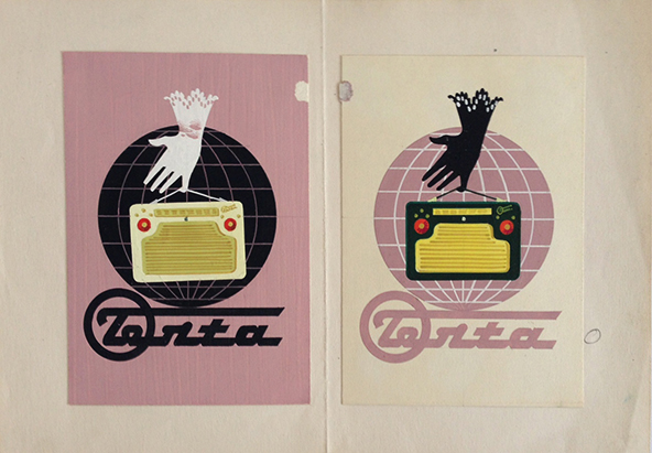
Two sophisticated painted artworks for one of the legendary Terta portable radios, from 1956. These small pieces were created for the label of the box of the portable radio, by Lajos Vajda. Vajda was a prominent graphic artist who designed numerous poster designs during mostly the 1960s and 1970s. He designed a great number of movie posters and also created numerous advertisements for commercial companies as well. He could employ a number of techniques and styles with an excellent taste.
This portable radio was a product of TERTA, mostly known as ’Telephone Factory’ which was an innovative Hungarian telecommunication company in the 20th century. The history of the factory dates back to 1876, but it was called Telephone Factory from 1904. The first vacuum tube transmitter was created here in 1918, and the company also started producing radios in 1924-25. Later the range of products of got wider and wider, and the Telephone Factory had new and new own developments. Telecommunication was essential during the WW2, and TERTA had an important role in producing electronic military equipment. After this progression, the 1949 nationalization made some years of depression for the company. Later, in the second part of the 1950s, it started to produce high-quality tape recorders and radios for consumer use. TERTA was one of the first factory which produced tube and transistor portable radios which were higly popular in the period. In the 1960s the right of radio-producing was only given to a competitor company and later TERTA had to change its profile and become a computer science company. With the change of the regime the factory was privatized by Siemens, and continued to produce until 1991.
These small artworks are from the second part of the 1950s, the heydey of the Telephone Factory. This artwork depicts a T 406 B type which was a 2 tube portable radio from 1956. Both artworks are painted and they are based on the same composition: a hand in a beautiful glove for women holds a Terta T 406 B portable radio with the little finger in front of a globe-motif and the name of the brand appears below. The colours are different though. The first version employs a pastel shade of pink in the background, the globe-motif and the brand name are black and the glove appears in white. The second version uses a white background, the globe-motif and the brand name are pastel pink, and the glove is depicted in black. The portable radios are in the center of the compositions and their colours differ as well. It contributes to the delicateness of the image that on both versions the gloves have a pattern and the globe-motif has a graticule in the colour of the background.
The glove can be considered as the most archaic element in the composition as it evokes the visuality of a quite earlier period, the atmosphere of the turn of the century. The globe-motif was used in Hungarian poster art from the 1920s, but it was reused many times later, too. In case of this image, the globe-motif could possibly refer to the fact that Terta portable radios were popular in several countries, as the company produced for export as well. The images of the portable radio and the brand name represent the current visuality of the popular culture of their period. The Terta brand name had several designs throughout history, always reflecting the contemporary typographic design trends. This font can be easily recognised as it was typically used in the 1960s. Thus, the composition is a very interesting combination of elements, still it is highly decorative.
It is also interesting that the National Advertising Company adviced this artwork for final use, but only with a bit of modification. It can be read on the backside: ’The radio shouldn’t be held by the little finger.’ Obviously, the design was aimed to highlight the innovation and easy use of portable radios, but the advertising company could feel that holding something with the little finger can seem too neglectful or even pejorative. Anyway, these portable radios were 3 kgs, so it is also slightly exaggarted to portray them as light as a feather. Nevertheless, the main idea of the design is clever.
Both artworks are decorative and interesting designs, created for an iconic item of the period, the portable radio.


