Görög Lajos
1927 - 1995
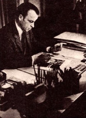
Lajos Görög
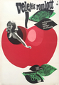
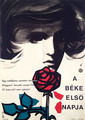
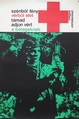
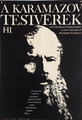
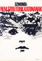
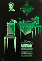
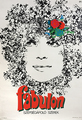
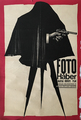
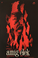
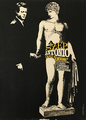
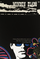
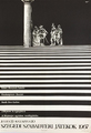
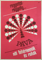
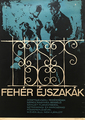
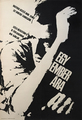
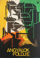
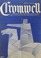
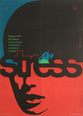
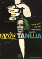
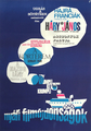
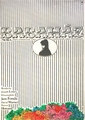
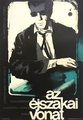
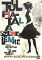
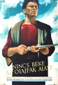
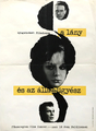
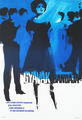
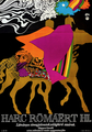
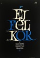
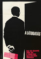
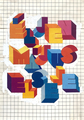
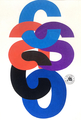
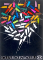
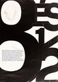
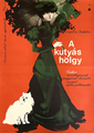
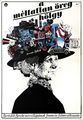
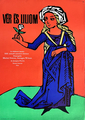
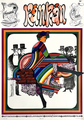
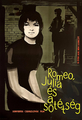
An important figure of the flourishing poster art movement in the 1960’s and 1970’s, Lajos Görög’s most outstanding creations are his movie posters and his typographic works.
Görög has studied at the University of Applied Arts between 1946 and 1948, under Sándor Bortnyik, then after its reorganization in 1949-1951, at the University of Fine Arts under György Konecsni.
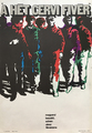
From 1963 on, Görög was member of the Papp-group and took part in their exhibitions. He started his career at the end of the 1950s and joined the expressive, painting-like poster style that arose in response to the strict socialist realist style. Görög employed sharp contrasts and picturesque effects on his works, which often show a monochrome colour scale. This expressive style of him appeared on the posters of the early 1960s as well.
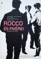
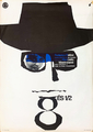
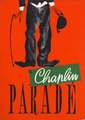
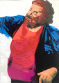
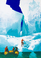
In the 1960’s, Görög played an important role in the resurgence of the movie poster. He used a wide range of techniques: paper cut, delicate and fine drawing, oil painting, ‘burned’ (strongly contrasted) photos, montage and colour photographs as well. One of Görög’s most famous works is a very unique and elegant design for the Fellini movie “8 and ½”. He also produced a notable poster for “Rocco and his Brothers”.
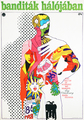
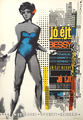
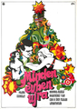
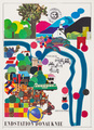
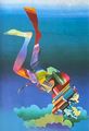
Besides his powerful photo-based designs, some of Görög’s works show the influence of pop art and neo-secession. These designs are colourful and are constructed by the use of decorative lines and coloured areas. Some of his works even show the influence of the visual world of comics.
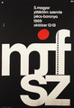
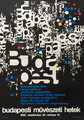
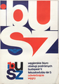
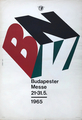
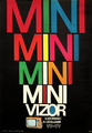
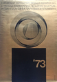
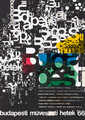
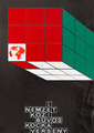
From the end of the 1950’s, Görög also prefered the pure typographic design, which is more apparent in his art in the 1960’s. Gábor Papp, with whom Görög had an excellent relationship, might have been an influence on this change in style. Görög also worked with pure, clear geometric forms and elegantly shaped letters. He created several successful emblems and logos, such the ones for BNV (Budapest International Fair) and Ibusz (Hungarian Tourism Company).
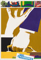
In the 1970's, he created some Pop Art tinged movie poster designs marked by strong contrasts.
An interview with the artist in Lobogo Magazine from 1970:
8½, Haber's Photo Shop, He Who Must Die. Film frames, memories flash upon seeing the well-known posters. In the home of the graphic artist Lajos Gorog, winner of the Munkácsy Award, I came across the film chronicle of the past years.
— I have worked a lot, and I still work today for MOKÉP. It is an interesting task for a graphic artist to take the viewer by the hand and bring him to the cinema. Especially today, since interest in films is decreasing throughout the country. They say that propaganda is also involved in this.
— And...?
— There may be something in it. It is difficult to speak to everyone at once. To say a lot in a concise manner. To arouse interest without revealing anything essential about the film. And besides, there are many other constraints.
— For example?
— For example, the client has certain reservations. It is understandable that the country of production, the genre of the film, the participation of famous stars as a seductress and so on and so forth must be disclosed. Fashion also ties the hands of the creator.
— Poster art is a fashionable art. In the sense that it is the outpost of certain pioneering trends in fine art among the general public. It is also natural that the illustrator is not happy with the amount of text. In addition to all this, no matter how much he protests, his artistic self-esteem is shaken, we must first sell something. Namely a film. So perhaps artistic aspects must be subordinated to commercial aspects. The meeting of the two is the great, lucky date.
— Art and commerce. Not exactly the most tasteful combination of concepts.
— But it is natural for the poster designer. I like to say that, unlike the painter, who, if the finished work is good, exhibits it: we have to make something good, or at least acceptable, by the deadline. We are a bit like actors; we have to play the role that has been assigned to us. But within this, the possibilities are enormous, and success is also a given.
— Recently more and more posters using bold, innovative solutions are appearing on the streets.
— Thank God, official criticism is more lenient with our genre than with fine art. That's good. But I think it's also because the poster can represent a kind of mission in shaping public taste. Of course, this also comes with a lot of responsibility.
— You mentioned that you work a lot. A gag, a striking, good idea are essential for this genre. Isn't the constant "brain-twisting" tiring?
— Yes. It's very tiring and exhausting. They present 120-140 posters a year. It's true that MOKÉP is purposefully expanding its graphic team, but everyone still gets a lot of work. And each subsequent poster has to trump the previous one. You always have to play your trump card. Partly to stay competitive, because the authorities decide based on two or three graphic sketches, “offers”, and partly because an idea only works once, can be effective once.
— You are an advertising graphic artist...
— Of course, I do a lot of other things besides film posters. Brochures, logos, and everything else that belongs to this field.
— It’s an exciting profession.
— Fortunately, it’s the same here. For a long time, we used to “ring the bell because that’s the way it’s done” with advertising here. This was our “Shoes from the shoe store” era. Today, there’s something to advertise and competition between companies is also developing. And this — I think — will expand to the benefit of all of us.